Through a deep strategic process, I crafted a brand that embodies clarity and direction while maintaining a warm and approachable presence.
Client
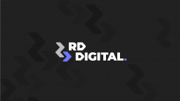
RD Digital
Services
Brand Identity
Logo Design
Brand Strategy
Brand Guidelines
Logo Animation
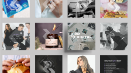
RD Digital needed new branding that captured their forward-thinking, solution-focused approach to digital marketing. Through a deep strategic process, I crafted a brand that embodies clarity, direction and professionalism while maintaining a warm and approachable presence.
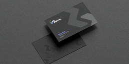
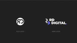
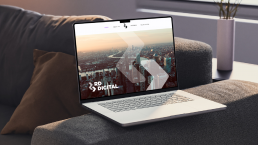
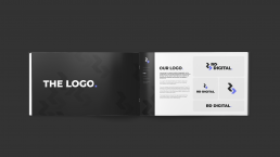
At the heart of this branding is a triangular logo mark, which is forms letters “R” and “D.” This design is not just a stylistic choice, it symbolises movement, progress and precision, reflecting RD Digital’s commitment to guiding clients through their marketing journey with clear direction. The sharp angles convey confidence and expertise, while the symmetry represents balance, structure and well-executed branding strategy.
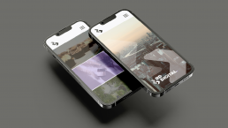
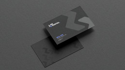
A carefully curated colour palette enhances the brand’s impact while staying true to its core mission, content first. The primary colours are predominantly black and white, allowing the brand to sit subtly in the background, ensuring RD Digital’s work and content take centre stage. This minimalist approach provides a strong, timeless foundation.
The purple accent colour serves as a strategic highlight, cutting through the noise and giving RD Digital a unique, recognisable edge that stands out against competitors when needed.
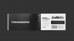
The typography strikes balance between professional expertise and approachability. A clean, modern typeface reinforces RD Digital’s clarity and transparency, while rounded elements soften the aesthetic, ensuring the brand feels both reliable and welcoming. This branding is a perfect fusion of strategy and design, ensuring RD Digital can communicate its expertise, values, and unique approach with confidence and consistency.