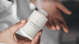
Branding and logo design inspired by kundalini energy reflecting calm and high-end approach to holistic healing.
Client
Harmony Rising
Services
Brand Identity
Logo Design
Brand Strategy
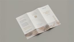
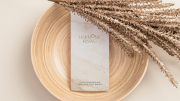
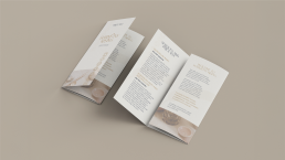
Print Design
Digital Design
Social Media Content
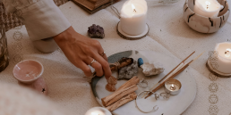
Harmony Rising is a soulful wellness brand offering intuitive energy healing, Kundalini Reiki, subconscious reprogramming, and holistic support for women navigating physical, emotional, and energetic transformation.
The brand needed a calm, high-end identity that would reflect the depth of its offerings while remaining approachable and spiritually grounded.
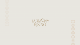
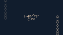
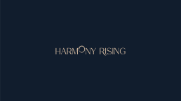
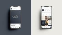
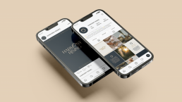
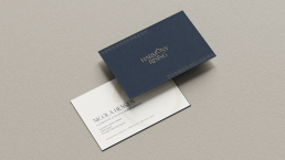
The final logo is a refined word mark, using a delicate serif font to convey elegance, clarity and lightness. The key design element is the raised “O” in Harmony, which has been subtly reimagined to resemble both a rising sun and a coiled kundalini snake, symbolising inner awakening, energy flow and the spiritual path. The lifted form also reflects the brand’s core message of rising into alignment and reconnecting with one’s light.
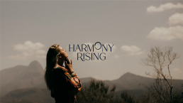
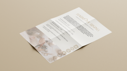
Strategically, the identity draws on visual cues from nature, ritual, and vibrational healing, supporting a sense of peace, movement, and depth. The wider visual language includes soft earthy tones, minimal design elements and intentional spacing to mirror the experience Harmony Rising offers: intuitive, healing, and energetically clear.
This identity extends across social media with a thoughtful content strategy and Instagram feed design, created to help the brand educate, inspire and grow a heart-aligned audience online.
You can check out their Instagram page here